Creating a calm and relaxing atmosphere in your home often starts with the colors you choose for your walls and décor. Colors can influence mood, energy levels, and overall comfort, making it essential to select shades that promote peace and tranquility. Whether you’re repainting a single room or planning your entire home’s color scheme, these tips will guide you in choosing calm colors that help create a soothing space.
Why Choose Calm Colors?
Before diving into specific color choices, it’s helpful to understand why calm colors matter. Calm colors tend to be soft, muted, or neutral shades that don’t overwhelm the senses. They help reduce stress, promote relaxation, and can even improve focus. This makes them especially suitable for bedrooms, living rooms, and any space where you want to unwind.
Popular Calm Color Families
1. Blues and Soft Greens
Blue is often associated with the sky and water, evoking a sense of calm and stability. Soft blues, such as powder blue or pale turquoise, can instantly create a serene environment. Similarly, soft greens—like sage or mint—bring a touch of nature indoors and have a refreshing, calming effect.
2. Warm Neutrals
Warm neutral tones like beige, taupe, and soft browns create a cozy yet peaceful atmosphere. These colors work well as a backdrop to more vibrant accents or natural elements like wood and plants.
3. Muted Pinks and Lavenders
Soft pinks and light lavenders can introduce a gentle, nurturing ambiance. These shades are subtle enough to maintain calm without being overly feminine or bold.
4. Soft Grays
Gray is a versatile neutral that can feel modern and sophisticated. Choosing lighter shades of gray with warm or cool undertones can help establish a tranquil space.
Tips for Choosing the Right Calm Colors
1. Consider the Room’s Purpose
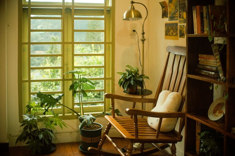
Think about how you use each room. Bedrooms and reading nooks benefit from peaceful blues or gentle greens. Living rooms can use warm neutrals to encourage relaxation and socializing. Home offices might use muted grays or soft blues to support focus and calm.
2. Test Colors in Different Lighting
Natural and artificial lighting can significantly affect how a color appears. Paint a small section of your wall or use sample boards to observe the color at different times of the day and under varying light sources.
3. Use Color Palettes
Pick a base calm color and create a palette by combining it with complementary or analogous colors. This approach helps maintain harmony while adding depth and interest to your space.
4. Balance Colors with Textures and Materials
Colors don’t work alone. Incorporate natural materials like wood, linen, or cotton to enhance the calm feeling. Soft textiles and smooth finishes can complement your color choices and add warmth.
5. Avoid Overly Bright or Saturated Shades
While color is wonderful for expression, very bright or intense colors can disrupt calmness. Stick to pastel, muted, or dusty versions of your favorite colors to keep the vibe peaceful.
How to Apply Calm Colors in Your Home
Walls
Painting walls in calm colors sets the tone for the entire room. Consider using a feature wall if you want to introduce a slightly deeper shade without overwhelming the space.
Furniture and Decor
If painting isn’t an option, introduce calm colors through furniture pieces, throw pillows, rugs, or curtains. These elements can bring softness and color without permanent changes.
Art and Accessories
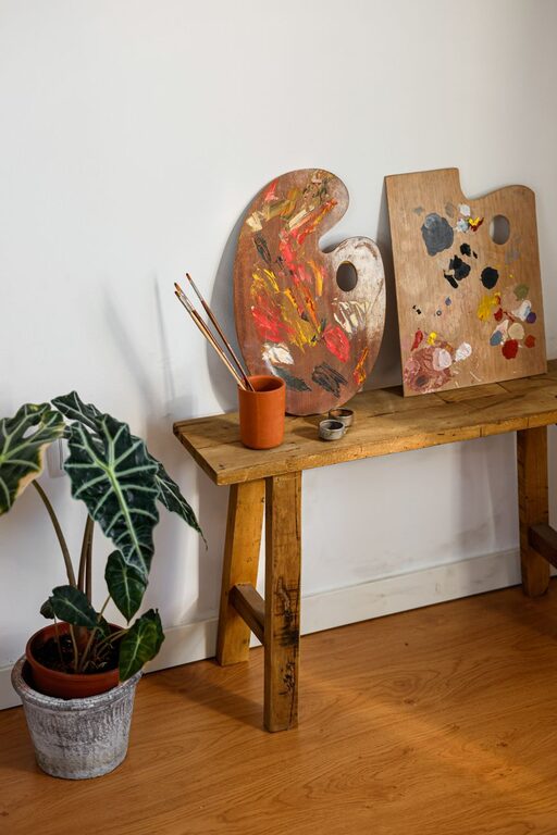
Calm colors can also be featured in artwork, ceramics, and decorative objects. Choose pieces that complement your main color scheme to maintain a cohesive look.
Final Thoughts
Choosing calm colors for your home is a simple yet effective way to create a peaceful retreat. Take your time to explore color options, consider lighting, and think about how you want to feel in each space. With these tips, you can design a home that feels soothing and inviting every day.
Remember, the best calm color for your home is one that speaks to you personally and enhances your comfort. Happy decorating!
About the Author